I’ve got 99 problems but reading graphs (fortunately) ain’t one
Written by Amanda Dumoulin
Statistics are everywhere. If you read an article in the newspaper, you will often see that journalists support their story with data in the form of numbers or graphs. Additionally, companies will often show graphs and charts to compare their product’s performance to their competitor’s. If someone doesn’t know how to read or interpret these graphs, they may just assume that the journalist or company is presenting the data in a way that is accurate or intuitive to readers. Do the graphs accurately represent the data?
Let’s look at one way that graphs can be deceiving: manipulation of the vertical axis.
Bar Graphs
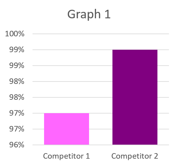
One example of manipulating the vertical axis is zooming in on the data, or changing the starting number on the vertical axis (in this example, starting at 96% instead of 0%). Zooming in on the data can make it look like there is a large difference between two datapoints when there is actually only a small difference.
Although the graphs below contain the same information, they appear to tell two very different stories.
It is important to look at the vertical axis to see what units the graphs use. In this case, you can see that both graphs show the difference between Competitor 1 and Competitor 2 is only 2%, which is a very small difference. By making Graph 1 start at 96% instead of 0%, the difference between the two competitors appears much larger in Graph 1 than in Graph 2.
When looking at these types of bar graphs, it is important to be wary of the vertical axis and think about what the actual numbers are.
Line Graphs
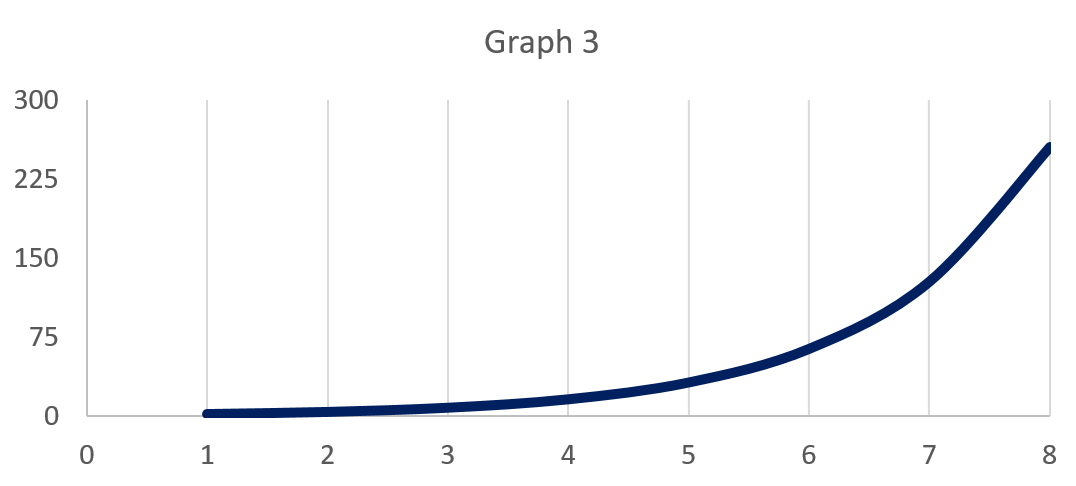
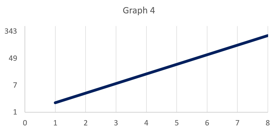
Here is another example where the vertical axis deceives. The next two graphs show the same data (if you are curious, they are both a graph of y = 2^x).
For Graph 3, the scaling is standard: Both the horizontal and vertical axes increase by intervals of 1. You can see this by looking at the vertical axis and seeing that there is an equal distance between each number (i.e., the distance of the spaces between 0 and 75 and 75 and 150 are the same—75 units apart).
However, for Graph 4, the vertical distance of the spaces between 1 and 7, 7 and 49, and 49 and 343 on the vertical axis are all the same. While the distance between each number in Graph 3 is consistently 75, the distance between each number in Graph 4 is not consistent (i.e., there is a greater difference between 49 and 343 than between 1 and 7). Without looking at the scale of the vertical axis, Graph 3 appears to have a more sudden and dramatic increase over time compared to the steady, linear-appearing increase of Graph 4.
COVID-19 Example
Now let’s look at an example from a September 2020 COVID-19 report. The purpose of this graph was to show the number of COVID-19 tests completed compared to the percentage of positive tests.
Photo received from Ontario Agency for Health Protection and Promotion (Public Health Ontario; https://files.ontario.ca/moh-covid-19-report-en-2020-09-27.pdf).
Over the six-month period shown, there is a lot of variability in the number of tests (left vertical axis) and the percentage of tests (right vertical axis). Note that in this example, the overall number of completed tests increased and the percentages of positive tests decreased.
The issue with comparing these numbers on the same graph is that the scale of the left and right vertical axes is not the same. The left vertical axis uses the standard scaling outlined in the preceding explanation of Graph 3: It increases at the same rate through the whole axis. However, the right vertical axis shows a percentage. To calculate the percentage in this example, you must take the number of tests that were positive on each day and divide it by the total number of tests completed on that day. Those numbers vary from day to day.
At first glance, it may look like the total number of positive tests decreased over time. However, if you look around April 19 and September 20, you can see that in April there were about 9,000 tests completed and around 8% of those were positive, and in September there were about 40,000 tests completed and about 2% of those were positive. This comes out to about 700 positive tests in both April and September. Of course, these are two arbitrary points within the full scope of the data, but this graph could easily (and incorrectly) be interpreted as showing that the number of positive cases decreased dramatically. Actually, it was the percentage that decreased, likely in large part due to the drastic increase in testing that occurred between March (about 4,000 tests per day) and September (about 40,000 tests per day).
Conclusion
When reading the news or seeing marketing campaigns, it is important to view the information critically. It can be very easy to misinterpret data, particularly if the people posting figures or graphs want to paint a specific picture of the situation. Because graphs and charts are an intuitive way to view and interpret data, knowing how to critique what you see is an important skill. This is particularly important given the abundance of easily accessible data and information available to us.
If you enjoyed this blog post, check out our other blog posts!
References
Ontario Agency for Health Protection and Promotion (Public Health Ontario). (2020). Daily epidemiologic summary:
COVID-19 in Ontario: January 15, 2020 to September 26, 2020. Retrieved from https://files.ontario.ca/moh-
covid-19-report-en-2020-0927.pdf
For more in-depth reading:
Loftus, G. R. (2002). Analysis, interpretation, and visual presentation of experimental data. In H. Pashler & J. Wixted (Eds.), Stevens' handbook of experimental psychology: Methodology in experimental psychology (pp. 339–390). John Wiley & Sons Inc. http://faculty.washington.edu/gloftus/Research/Publications/Manuscript.pdf/Stevens%20chapter%202001.pdf
Disclaimer
The blog posts are for informational and educational purposes only. The posts should not be considered as any type of advice (medical, mental health, legal, and/or religious advice). All blog posts have been researched, written, and edited by the undergraduate students and alumni of the Lifespan Cognition Lab. As a teaching and research-based lab, we encourage all lab members to help make knowledge more accessible to all communities through these posts.


